Even though it is easier to create a website than it ever has been before using a website builder, the vast number of websites already on the internet has made it harder than ever to stay afloat and stand out among the competition. Many optimistic internet entrepreneurs will start their websites at the click of a button only to watch themselves drown in the sea of other similar websites.
There are many reasons why a website may not prosper. These can include a lack of audience, lack of content, or oftentimes just not being user-friendly enough in regards to the UI, or user interface.
In this article, we’ll take a look at many of the key reasons websites don’t take off like their creators want them to so that future prospective website runners can be aware of the most common website mistakes to avoid.
1. Not Focusing on a Specific Audience
As the internet has progressed, general audience sites such as About.com is no longer the way to go. With the plethora of content now available on the internet, it is impossible to stand out without satiating a specific niche audience that will specifically search out your website for content that pertains to them.
Because of this, it is important that before you even go about creating a website you have established an intended audience that your content is going to be marketed.
It is a good idea that the audience that you are marketing towards is an audience that you either understand sufficiently or are a part of. In this internet culture, fakes will only go unnoticed for so long before some clever users figure out that your website isn’t really part of their culture and is just exploiting and cashing in on their passions.
If you aren’t well-versed in or a part of the culture you are marketing towards, you can solve this problem by hiring someone who is. Make sure that either you or someone on your team is sufficiently knowledgeable about both your target demographic and the kind of content they will want to see.
2. Not Having Clear Intentions for the Website
It is also important that the users of the website know what they are going to get when they visit your website. This goes beyond a general area of knowledge and gets more into specifically what exact function the website provides.
For instance, Google is a search engine first and foremost. Google has become the most popular site in the world by providing people with an incredibly useful function and sticking with it, making sure that every single visitor sees that search bar as soon as the site pops up, even if other things such as news show up somewhere down below.
If Google were to suddenly eschew the search bar and start displaying user-based restaurant reviews as soon as the site loads, people would be confused, angered, and would seek an alternative. Luckily, Google is smart enough to realize this.
While Google is a very broad example, making sure your website serves a specific function is integral to all aspects of internet success for all fledgling websites.
Users generally know what they want to do when they get on the internet. They want to shop, or they want to read the news, or they want to find information about specific topics that pertain to them. They want to know exactly where to go to have their needs met. If they go to a certain website under the pretence that the website will serve their needs and it doesn’t, they will be angered and confused.
3. Too Slow to Load and Browse
Poor website hosting or an abundance of ads will cause a website to perform sluggishly. This is a huge nuisance to modern internet users who will want speedy browsing and to have their needs met at the push of a button.
It is also important to optimize your website design with the proper use of caches. A cache is simply a storage of files a website will hold on your device to increase the speed and performance of the website while you are browsing it. Files will be essentially preloaded so that you can browse the website seamlessly.
It is also important that you have a proper CDN (content delivery network). You should also have the right amount of servers for your intended traffic and user base. So choose your web hosting carefully.
4. Not Optimized for Use on Mobile Devices
This is one of the biggest website design mistakes that not everyone understands at first, but it is incredibly important. In this technological age, a vast number of internet users are browsing the internet on their smartphones as compared to their computers or laptops.
While smartphones are nifty little devices that can serve many of the same functions that laptops can do, a website formatted for use on a laptop or computer will be almost impossible to use if loaded exactly the same way onto a smartphone.
Because of this, websites generally need to have a specially formatted option just for use on smartphones. You can do this by creating a responsive website, having an alternative website option such as AMP for mobile, or providing a downloadable app specifically formatted for smartphones.
If your website is not in some way prepared for smartphone browsing then your user traffic will suffer a lot. This reduction in traffic will only increase as time goes on.
5. Low-Quality Content
Beyond all of the technical jargon, it is incredibly important that your website, whatever niche it’s aiming to fit in, has high-quality content. The content that is uploaded on a consistent basis will keep users invested, preventing them from seeking out competitors.
If you are not up to the challenge of providing consistent content, you will need to hire writers that will be able to make the content for you. This can be pricey and time-consuming, so be sure you know what you’re getting into.
If a user goes to your website enough times and sees nothing new, they will stop visiting. Be sure to give the people what they want and keep them coming back for more.
You can also use analytics to see what kind of content your prospect audience is gravitating towards. Know your market & your audience and cater to them.
6. Poor Scanability and Readability
Most of the users will not have time to read your text, so you should make it easy for them to scan the articles.
This means that you should have consistent formatting (i.e. headings, structure, and fonts), large enough fonts to read and an attractive colour design. It is a good practice to break down the large chunk of text into small digestible text, subheadings, and bullet points. You should also use whitespace as necessary to make your content easy to scan and read.
Be sure to use high-quality, properly formatted images that are pertinent to the type of content your website is delivering. People are attracted to visual content, but make sure the images add context to the content and do not confuse users.
7. Poor UI and Navigation
One of the top website mistakes to avoid is to ensure that the website is intuitive and that new users can pick up on how to navigate it as soon as they visit. This means having easy-to-use menus with proper internal linking among different sections of the site.
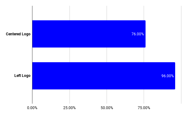
You should stick to the proven navigational guidelines. For example, moving your logo from the top centre to the top left corner will increase the chances of users being able to come back to your homepage from 76% to 96%.

Web users have little patience and you need to make sure you make it easy for them to navigate your website. Your website should be able to keep directing users to the next logical step, so they can easily get all they need from you.
8. Not Able to Earn Trust from Users
Another website design mistake that can turn off users is the website not using HTTPS. This shows the users that the website is not secure. Also, the website will either not load on certain browsers or at least will show up with a warning that your website is not secure. This is a huge turn-off for prospective users.
Besides this setting, you will want to make sure that you have up-to-date contact information. So users can reach you about any problems pertaining to the site and suggestions for increased user-friendliness.
Easy linking to social media and the ability to share content are also huge plus. Your website should have sharable links that will post content directly to users’ social media if they wish to share it with their friends or family. This is not only something that will please current users but also something that will greatly increase the traffic from new users who may become regular visitors.
9. Brand Confusion
Lastly, you will want to make sure that your website has focused and consistent branding.
You will need a logo that looks professional and shows up on every single page of your website consistently with the same formatting and design. It is important to provide consistent and constant content that communicates your brand has a clear intention for your user base.
You will want to make sure that the function and content that your website provides stay in the mind of the user. This is because function and content go hand-in-hand with your brand recall-ability. This will communicate to the user that they can count on your brand to satiate their specific needs.
Just as Google is synonymous with search engines, Rotten Tomatoes is synonymous with movie reviews, and CNN is synonymous with news, you will want to make sure that there is a clear correlation between your website and your brand. This is what makes use of a website second nature to users and makes a website become a monolith.
Conclusion
While creating a website used to be something that would take a certain about of technological know-how and expertise, advancements in internet technology and an increase in widespread knowledge about the internet have made it so that pretty much anyone can boot up the internet and create their own website. Because of this, the number of websites has skyrocketed over the past couple of decades, leading to an overwhelming number of sites to sort through in any Google search.
However, only a small number of websites stand out and succeed. By avoiding these common website mistakes, you can create a solid foundation for a successful web presence.


